Customer Connect
Working alongside Anet Japan, I led the design process for video calling system, “Customer Connect”. Leveraging WebRTC technology the web-application allows operators to connect with customers via video and audio calling. Further functionality includes managing call and chat history along with customer feedback ratings.
Understanding The Problem
Prior to Customer Connect being developed, Anet had created a working prototype for Shiseido Japan. However, shortly after releasing they felt the MVP was too difficult to navigate with too many call-to-actions. I was tasked with redesigning the entire application from scratch.
Design Process
I started with my typical “design-sprint process” aiming to get a working prototype in-front of operators within one week. I conducted user interviews to help highlight UX issues, particularly asking operators what features they would find beneficial, from this I found three common themes:
1. Difficulty creating calls
Operators wanted a simple way to create calls, there were too many buttons to navigate and felt a primary call-to-action was necessary. They also wanted notifications such as waiting states, connection and error messages.
2. Difficulty managing feedback
Often operators would make more than one call to a customer, but they had no way to confirm if they had called a customer before, or if they actually were interested in any products being advertised. Managing customer feedback was very difficult.
3. Lack of design consistency
Operators found the MVP lacked design consistency, particularly not knowing how buttons functioned. They felt overwhelmed with the different colors, layout and overall design. Simplicity was what they were after!
1. Create calls easily
To ensure operators could create calls easily I wanted them to be comfortable with the app layout first. I did this by de-cluttering any secondary buttons and having a full-screen view for the video feed. I created low fidelity mockups in Balsamiq to layout the application, later transitioning into Sketch 3 for UI design. I managed to remove 30 action buttons from the original design, keeping the interface clean and simple.
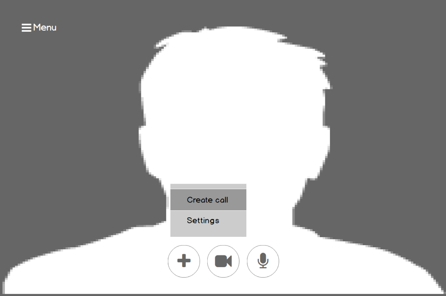
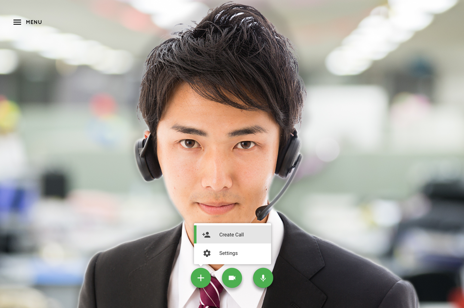
3 primary call-to-actions: 1. Create Call / Settings 2. Video off 3. Audio off
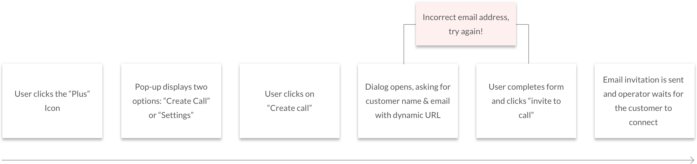
User Flow - Call Creation
Once the layout was optimized, I wanted to create a straightforward call creation user flow. I did this by working within the contraints of hidden modals and small steps or tasks ~ these even included error messages.
Clickable Prototype
Animation & Interaction Design
Material Design helped add UI consistency as well as improve micro-interactions for animation. These included hidden menu items with the core-draw-panel as well as the floating action buttons (FAB) for primary call-to-actions. When developing for the front-end, animations were powered by a combination of CSS3 and jQuery.
2. Call History & Customer Feedback
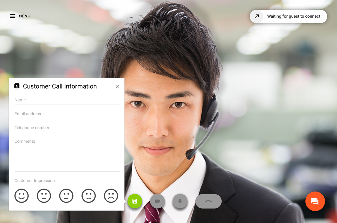
Operators wanted to have access to customer feedback at all times, whether “in-a-call” or even “out-of-a-call”. Through sketching and paper prototyping, I created two different user interactions for operators to rate and review customer feedback.
1. In Call
- Text form that slides out from the left with a simple 5-scale customer rating system
- Big little details: if the panel was open, call actions buttons were disabled if for whatever reason a call was ended
- Chat functionality was also available if the customer could not speak via video or audio calling
- At the end of the call operators could continue editing their feedback before closing

2. Call Logs
- Call logs were put into a separate view to maximise screen space while allowing operators to quickly glance at customer feedback data
- Operators can review past calls by narrowing search through text, ranking and date ranges
- By clicking into a separate customer profile, operators can find a detailed breakdown of any past calls including, customer information, chat history and overall feedback
- Operators were also given the option to download the customer information locally for internal marketing and database management
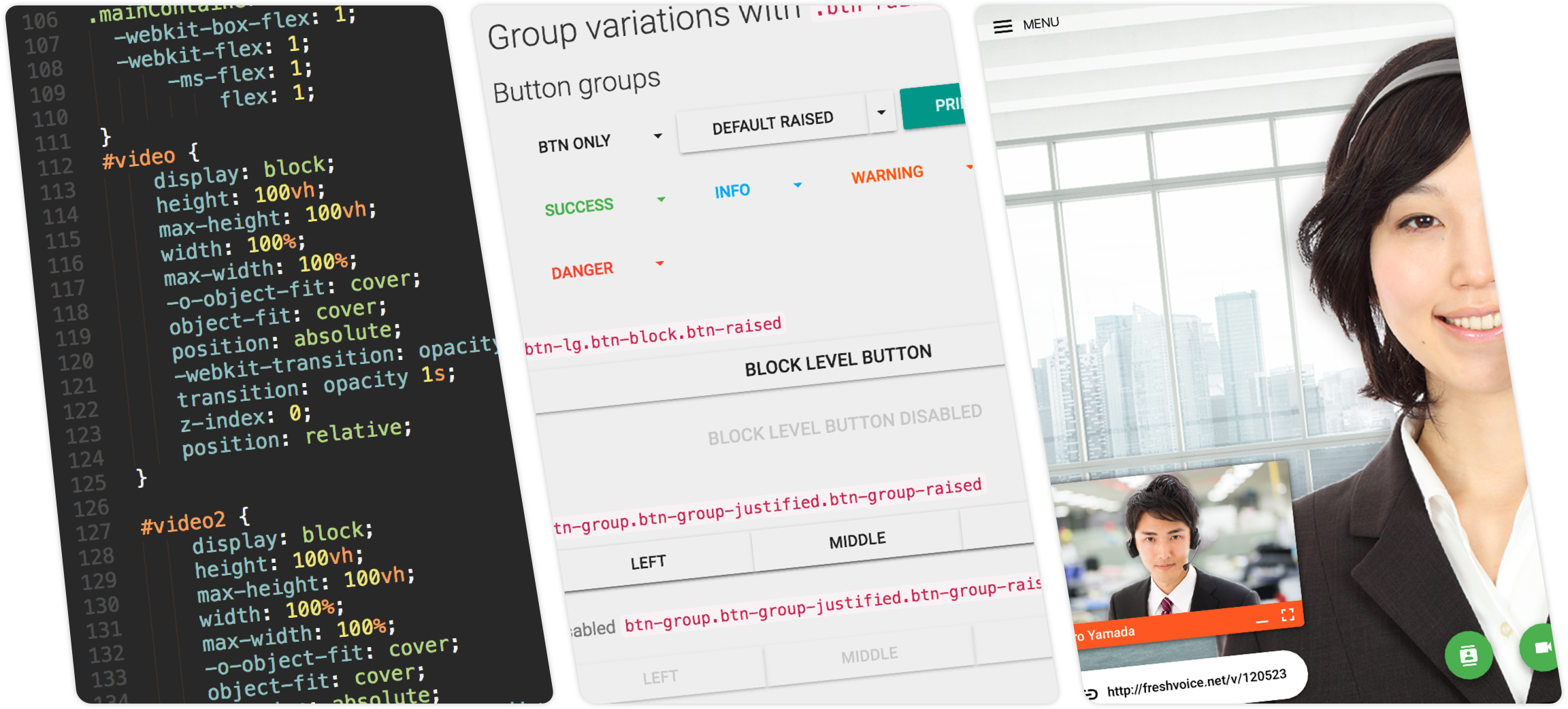
Bootstrap Material & Flexbox
After defining then user flow and overall design I began front-end development using the Bootstrap Material framework. It offered some nice out-of-the-box functionality, however, it was difficult to position elements exactly to my designs. I decided to navigate away from the traditional grid Bootstrap provides and develop with Flexbox layouts. By using “object-fit” and “flex” attributes I was able to position components exactly to my designs.
Retrospective
After designing the user interace I managed to get a working prototype in the hands of operators. I notified them that not all elements of the app were functional and it would be just a simulation. This user test was to validate if my designs solved the 3 main problems to:
- Easily create calls
- Review and manage customer feedback
- Implement UI consistency